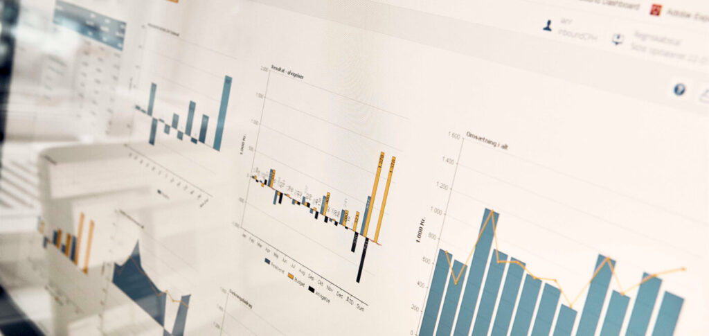
A marketing dashboard provides a single, consolidated overview that brings together your marketing and lead data from multiple sources in one place: advertising, web analytics, organic search, CRM, and newsletters. Instead of logging into each platform and manually retrieving numbers, you can track trends across channels and markets all in one place. A good dashboard is visualized so that the numbers are easy to interpret and accessible to the right people in the company. This guide walks you through the seven questions you should ask yourself before getting started.
A dashboard without a purpose gets forgotten
A dashboard is a good investment when it serves a purpose. That way, you have business-critical data at your fingertips; the numbers are visualized and thus easier to interpret; and they’re available to the right people in the company.
But a dashboard without a “why” doesn’t know what problem it’s supposed to solve. It gets built as version 1.0, then forgotten, and ends up as a dashboard that no one opens anymore. That’s why there are seven questions you should ask yourself before you either get started on your own or pay others to do it.
The Seven Questions to Ask Before Building a Dashboard
Most dashboard projects go off the rails at the same point: Data is collected before anyone has determined what the numbers will be used for. The seven questions below help you establish the correct order, so you build backward from the decision rather than forward from the numbers you happen to have access to.
Why do you need a dashboard?
Start here, always. Is it to save that half-hour of reporting every Monday? To track sales minute by minute on Black Friday? To give management a single place to see if marketing is contributing to the pipeline? Once the purpose is defined, the rest of the process becomes much easier. Sometimes you’ll even find that you don’t need a dashboard at all, and then you’ll save yourself the rest of the work.
Who needs this?
Different users have very different needs. A data analyst benefits from an abundance of data and the time to dig into why the numbers look the way they do. A CEO needs the opposite: fewer key metrics, a cause-and-effect relationship, and a recommendation for what to do next. That’s why a single dashboard often ends up becoming several if you have different types of users. That’s perfectly fine, as long as each dashboard is tailored to its specific audience.
What should I bring?
Your “why” determines your “what.” Sometimes it’s the data you already pull manually every month—it just needs to be automated. Other times, it’s something new you’d like to keep an eye on every morning. In both cases, it’s about identifying the numbers you actually act on and cutting out the rest as unnecessary clutter. The data you include must also be reliable, and that depends on the tracking and data, ...which is behind it, not the dashboard itself. If you look at the Google figures, they typically come from Google Analytics and the other Google platforms.
Where will it be used?
A small question with surprisingly great significance: Where and how will the dashboard be used? The purpose determines the format. If it’s going to be hung on the end wall of an open-plan office, use large fonts, few data sources, and simple visualizations. If it’s meant to be analyzed in depth by multiple people, create it as a report. If it’s for the weekly meeting, build it in a format you can copy directly into a presentation. Divide your ideas into “must-haves” and “nice-to-haves,” and save the latter for version 2.0. Keep it simple: Don’t include data you’re not going to look at anyway.
How should this be visualized?
The way you visualize information determines whether the numbers are understood correctly. Four rules of thumb go a long way:
- Put the number in context. A single data point means almost nothing on its own. Most numbers only make sense when viewed over the past few months or as a percentage of something else.
- Make it action-oriented. If a graph doesn't leave the reader with a sense of what should happen next, there's no need to include it.
- Choose the chart that best suits your data. Visual communication makes things easier to understand. Six colorless tables have the opposite effect.
- Keep the colors subdued. Choose five or six shades of the same intensity—preferably your brand colors—and use a single contrasting color to highlight what you want to emphasize. Remember that green and red carry their own meanings—both positive and negative—regardless of what the numbers show.
Which system should you use?
There are plenty of tools available, and the choice depends mostly on how complex your data sources are. Three of them come up repeatedly in our work:
Looker Studio (formerly Google Data Studio) It's free and full of plug-and-play features, ready-made templates, and third-party connectors. You'll go a long way by starting here.
Power BI is the way to go if you have diverse and complex data sources that need to be consolidated and processed. However, this often requires professional assistance.
Klipfolio is easy to use and integrates well with SQL databases and APIs, and it has a built-in layer for manipulating data, so you can, for example, multiply an exchange rate on the fly.
How do you get started?
Once you’ve answered the first six questions, all that’s left is to move from concept to implementation. Write a brief scope description for what you need—preferably one scope per department or dashboard. This keeps the project focused and makes it easy to see when something is starting to go off track.

Keep it simple, and keep it consistent
Two things will determine whether the dashboard is still in use six months from now. The first is to keep it simple: Start with a single dashboard for a select few people, and do it right from the start. One dashboard in hand is better than ten on the drawing board.
The second thing is to keep it up to date. Trim it down when you realize that half of it is irrelevant, and add new figures when you have a good idea or hear someone ask for the same data point for the seventeenth time. A well-functioning dashboard is the bridge from data to the decisions that drive the business, and from there on to the work of conversion optimization.
Frequently Asked Questions About Marketing Dashboards
What is a marketing dashboard?
A marketing dashboard is a single, consolidated overview that aggregates marketing and lead data from multiple sources to inform decision-making—for example, from advertising, web analytics, Search Console, CRM, and newsletters. Instead of manually retrieving the numbers from each platform, you can view them all together and visualized, making it easy to interpret trends.
What types of marketing dashboards are there?
Dashboards are typically organized based on who will use them and how. A data analyst needs depth and a lot of numbers, while an executive needs a few key metrics and a clear direction. In addition, there are channel-specific dashboards—for example, for paid search, organic search, or email—that focus on a single channel, as well as a cross-functional executive dashboard that brings it all together. Most companies end up with multiple dashboards, each serving a specific purpose.
How do you get started with a marketing dashboard?
Start with these seven questions: Why you need it, who will use it, what it should include, where it will be used, how it should be visualized, which system you’re building it in, and how you’ll go from idea to implementation. The most important thing is to start with your “why,” because without a purpose, the dashboard will rarely be used.
What is a CRM dashboard?
A CRM dashboard displays sales and lead data from your CRM—typically the sales pipeline, close rates, and lead sources—and thus draws data from a single source. A marketing dashboard is broader in scope and aggregates data from multiple sources, ranging from advertising and web analytics to organic search and email. One shows how leads move through the sales process, while the other shows how the entire marketing effort is performing.
Sources and Further Reading
Would you like some help getting started?
A dashboard project can quickly become complex, and you don’t have to tackle it alone. Our specialists will work with you to answer the seven questions to understand your business and your goals, and will build the dashboard based on data you can trust.