

What is mobile-first indexing?
Mobile-first indexing means that it is the mobile version of your website that Google indexes and displays in Google search results rather than the desktop version (also for desktop searches). This makes sense as the majority of people use their smartphone when searching on Google.
Content that only exists on the desktop version of your website will be completely excluded by Google. At the Pubcon Pro conference in mid-October 2020, John Mueller, Webmaster Trends Analyst at Google, stated that:
"We're now almost completely indexing the web using a smartphone Googlebot [...]. And one of the things that we noticed that people are still often confused about is with regards to, like if I only have something on desktop, surely Google will still see that and it will also take into account the mobile content. But actually, it is the case that we will only index the mobile content in the future. So when a site is shifted over to mobile-first indexing, we will drop everything that's only on the desktop site."
Not sure if your website is ready for mobile-first indexing? Or have you experienced changes in your visibility on Google? Now is the time to pay attention! The transition to mobile-first indexing can have a significant impact on your visibility on Google - positively or negatively, depending on whether your website is ready for the change.
When does mobile-first indexing come into effect?
Google's original plan was to move 100 % to mobile-first indexing on September 1, 2020, but there is good news for those who have not yet optimized their website for this change; the date is Postponed to the end of March 2021 - reportedly due to corona.
But that doesn't mean you can sit back in your good office chair! At least not if you want to avoid losing a lot of visibility on Google - because now is the last chance if you want to keep up with Google's development.
So let's take a quick look at what you need to know in general.
Check: Have you already switched to Google's mobile-first indexing?
Right now, Google mobile-first indexing is actually already enabled for many websites. No less than 70 % of all websites. To be on the safe side, you should start by checking if your website has already been switched to mobile-first indexing by Google.
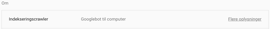
You do this by opening Google Search Console, Press "Settings" in the menu on the left and look under "About". Here you can see whether Google indexes your website using a smartphone (mobile-first indexing) or computer (desktop indexing):

As you can see in the image above, Googlebot switched its indexing of our website to smartphones back in August 2018. If you're not one of those who have been moved over yet, your status will look like this:
Do you have a responsive web design?
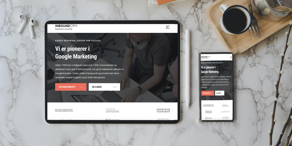
The meaning of responsive web design goes without saying; the design is responsive. This means that the layout adapts to the screen size, regardless of whether you are visiting the website from a computer, tablet or mobile - as you can see the difference between a tablet and mobile layout in the image below:
A responsive design is an optimal solution for mobile-first indexing - provided you display the exact same content (text and images) on the mobile version as on the desktop version. You must not Hide content on the mobile version of your website, tempting though it may be.
With a responsive website, you will notice a much smaller difference in the transition to mobile-first indexing (if it is mobile optimized) than websites that have a separate website for their mobile views like m.ditwebsite.dk. Separate mobile domains like m.ditwebsite.dk can have a number of technical issues.
You can use Google's mobile-friendliness test to check if your website is mobile-friendly.
Do a speed check of your mobile website
Another thing that Google focuses a lot on is speed. That's why it's a good idea to do a speed check of your mobile website and speed optimize it if necessary.
Note! The loading time of your website from a computer can be top-notch without it being so from a mobile phone.
One way to check the speed of your website is to open Google PageSpeed Insights (free), enter your website, press "Analyze" and select the mobile device tab:
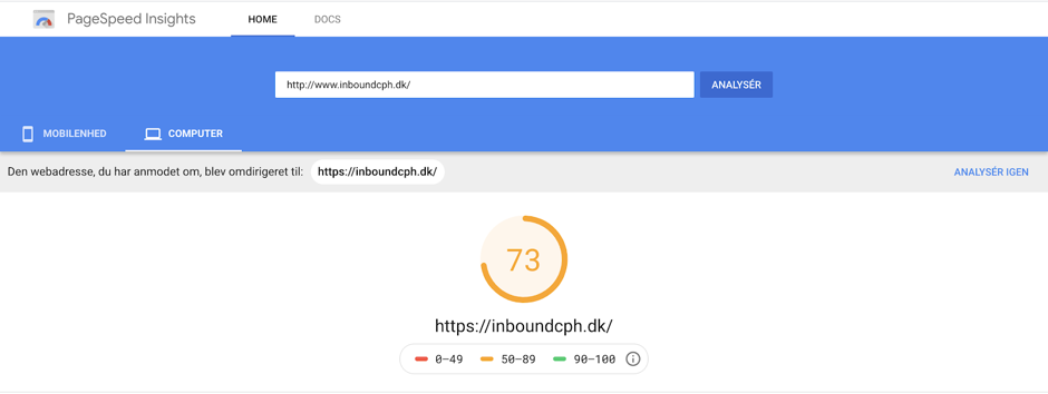
As you can see in the image above, it is possible to customize the analysis so that you can see the speed from a mobile perspective (see the button on the blue background in the top left corner). Your speed should preferably be in the orange field and if possible in the green field.
Optimize your website's graphical elements
Even if your website is responsive, it doesn't mean that all the elements fit perfectly. The difference in screen size and layout from desktop to mobile can affect the usability, readability and conversion rate of your website.
Therefore, pay special attention to whether buttons, images and text need a different size or placement on the mobile version. You need to ensure that the text is readable, that buttons are big enough for even thick fingers to hit and that pop-ups don't take up the whole screen - the latter can be very distracting for visitors and pop-ups that completely hide the actual content are definitely not liked by Google.
As a rule of thumb your body text should be minimum size 16 px on mobile devices - It improves the readability of the content and Google will probably reward you for that too.
Check out our Checklist for mobile-friendliness.